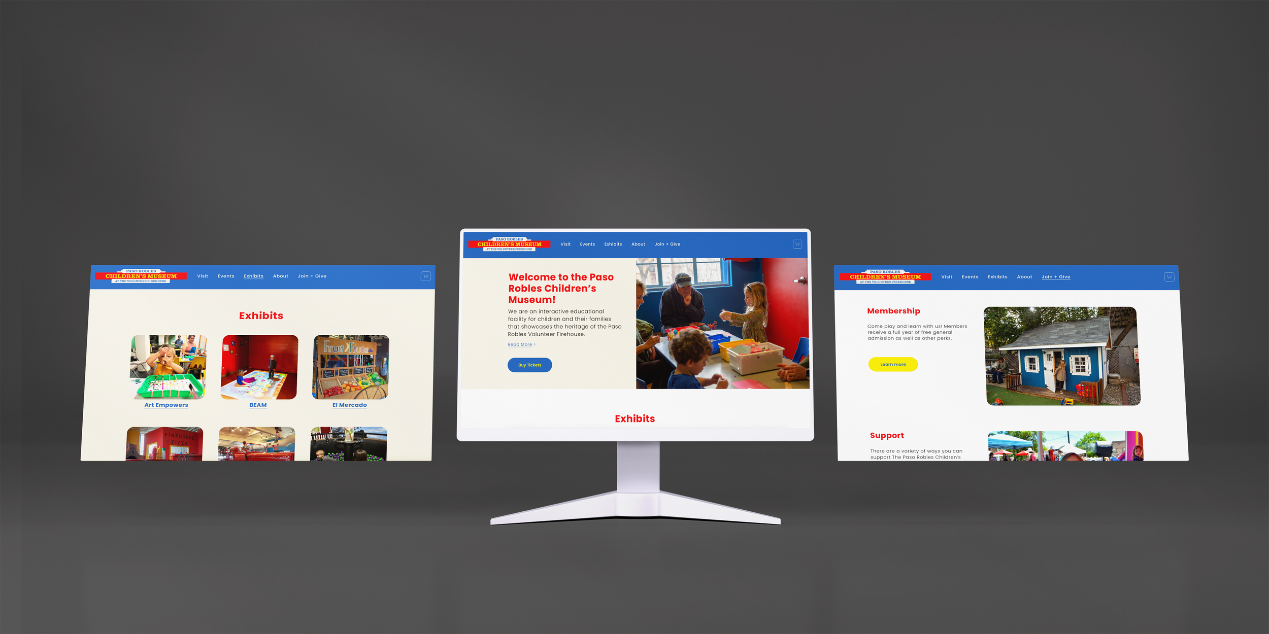
A modern and intuitive museum website that centralizes PRCM’s resources.
In this project, my classmate Shreya Hambir and I worked closely with the Paso Robles Children’s Museum (PRCM) director and our professor to redesign the museum’s website from end-to-end.
TEAM
Hannah Chan, Shreya Hambir
TIMELINE
8 weeks
TOOLS
Figma, FigJam, Adobe Lightroom, Squarespace
ROLE
UXR + Design
• INITIAL PROBLEM DISCOVERYBefore our redesign, the PRCM website had an outdated look that could potentially detract from the professionalism and credibility of the museum. Information throughout the site was disorganized and repetitive, often leaving users confused on how to navigate the site. The museum’s executive director, Sarah Parsons, expressed that the website was outdated and required an update. A snapshot of the website prior to the redesign is displayed below.
• UXRThe PRCM website is outdated.
Throughout project briefings and meetings, a recurring comment was that the museum website was “outdated”; thus, we set out to align the website with current market standards and trends. We began by conducting a heuristic evaluation of the museum website to identify the key usability problems. We also conducted heuristic evaluations on some well-established children’s museum sites like MOXI Children’s Museum in Santa Barbara and the Monterey Bay Aquarium, identifying three main elements to incorporate into ours.
Intuitive, streamlined menu
Large, eye catching images
Accessible link to purchase tickets
Align museum’s website with the current market standards and trends.
Place the museum’s educational value and community impact at the forefront.
Help users navigate with ease, minimize confusion, and ultimately increase user retention.
We identified three main objectives to guide our redesign process:
• SITE MAPWe audited the original website to evaluate its information architecture.
Branching out from the original navigation menu, we identified a few main problems:
Missing an “About” page. The user has to hunt through the website to gather information about PRCM’s story and mission.
The names of menu items don’t align with other well-known museum sites (menu items aren’t recognizable).
The many menu items (8) is visually overwhelming - information overload.
Unclear wording - what does “Groups” refer to?
Menu hierarchy isn’t utilized - menu items like “Parties” and “Groups” may work better as sub-menu items
Missing a footer. The user has to browse through the entire website to find contact information and other basic info.
Some sub-pages have minimal and outdated content, and could be combined or deleted.
Our new site map aimed to solve these issues.
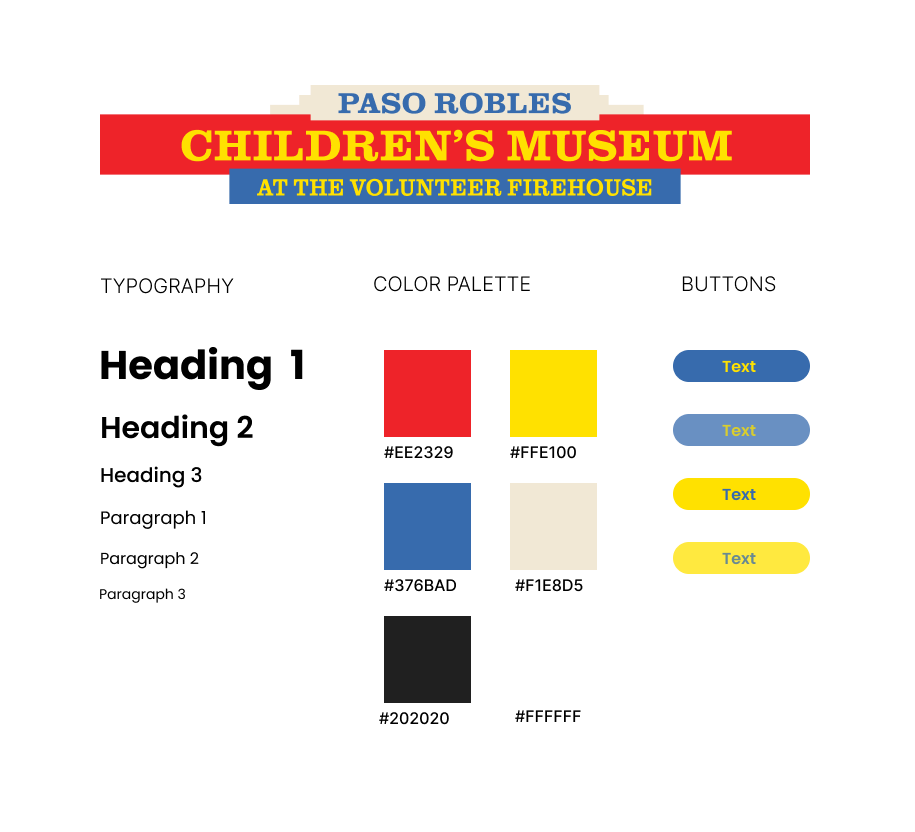
• DESIGN SYSTEMWhen creating the new design system, we didn’t want to stray too far from the site’s original colors or logo because they were used throughout the physical space of the museum and are a key part of its branding. We modernized the logo by simplifying it and removing the outlines around the text. For typography, we went with the sans-serif font Poppins, which we chose for its high legibility and clean, friendly appearance.
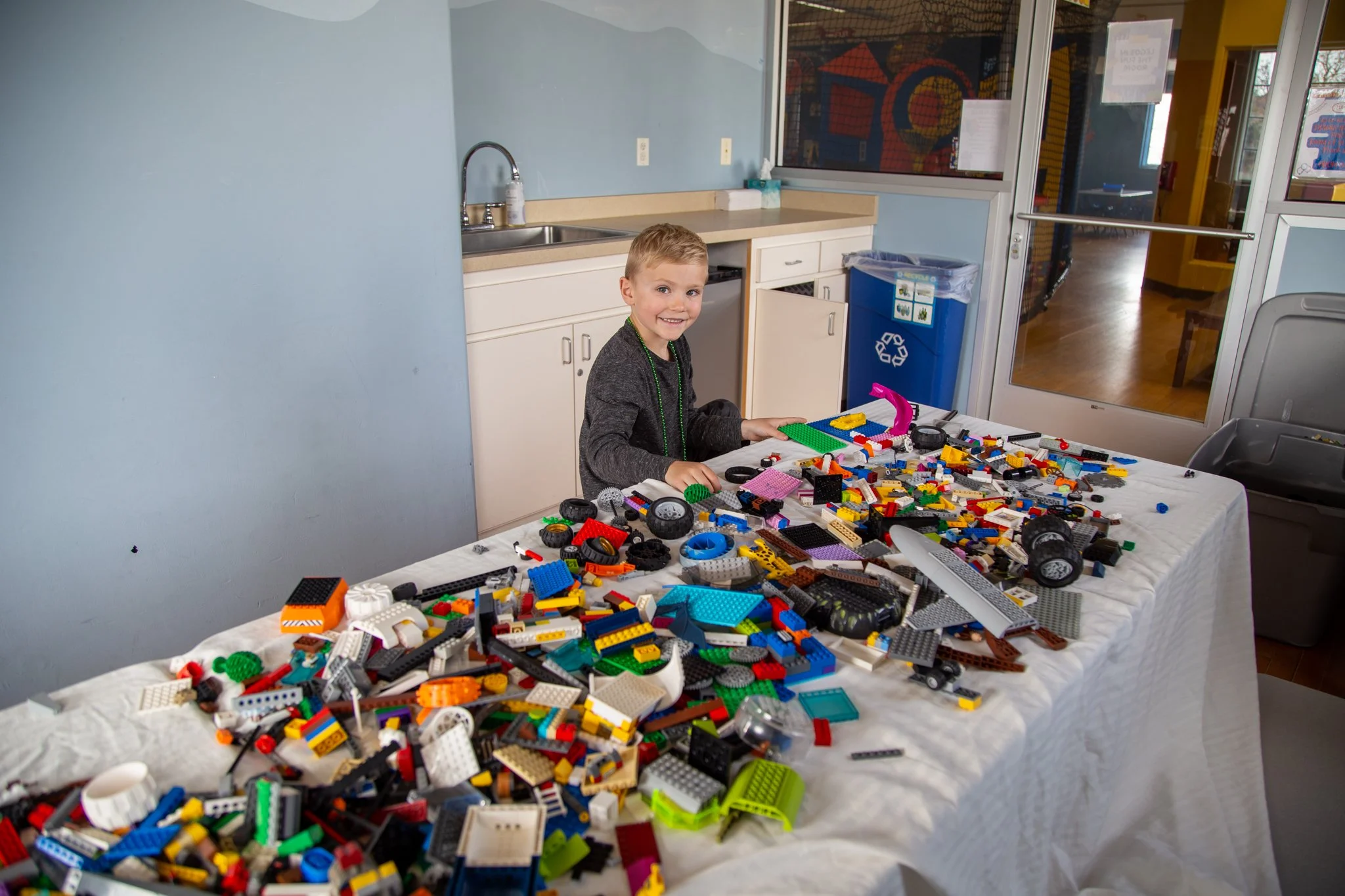
• PHOTOSCapitalize on photos to highlight the exhibits the museum has to offer and the “learn-through-play” environment the museum seeks to cultivate.
While the original site featured many photos of children playing, it was clear they hadn’t been updated in years based on the quality and varying image dimensions. Taking photos was a great opportunity for us to visit the museum ourselves and get a feel for its atmosphere and exhibits. It allowed for me to connect with the project on a deeper level as I grew a personal appreciation for the museum, the people there, and its mission.
• OUTCOMEThe site is now live at pasokids.org and has been handed off to another group of students.
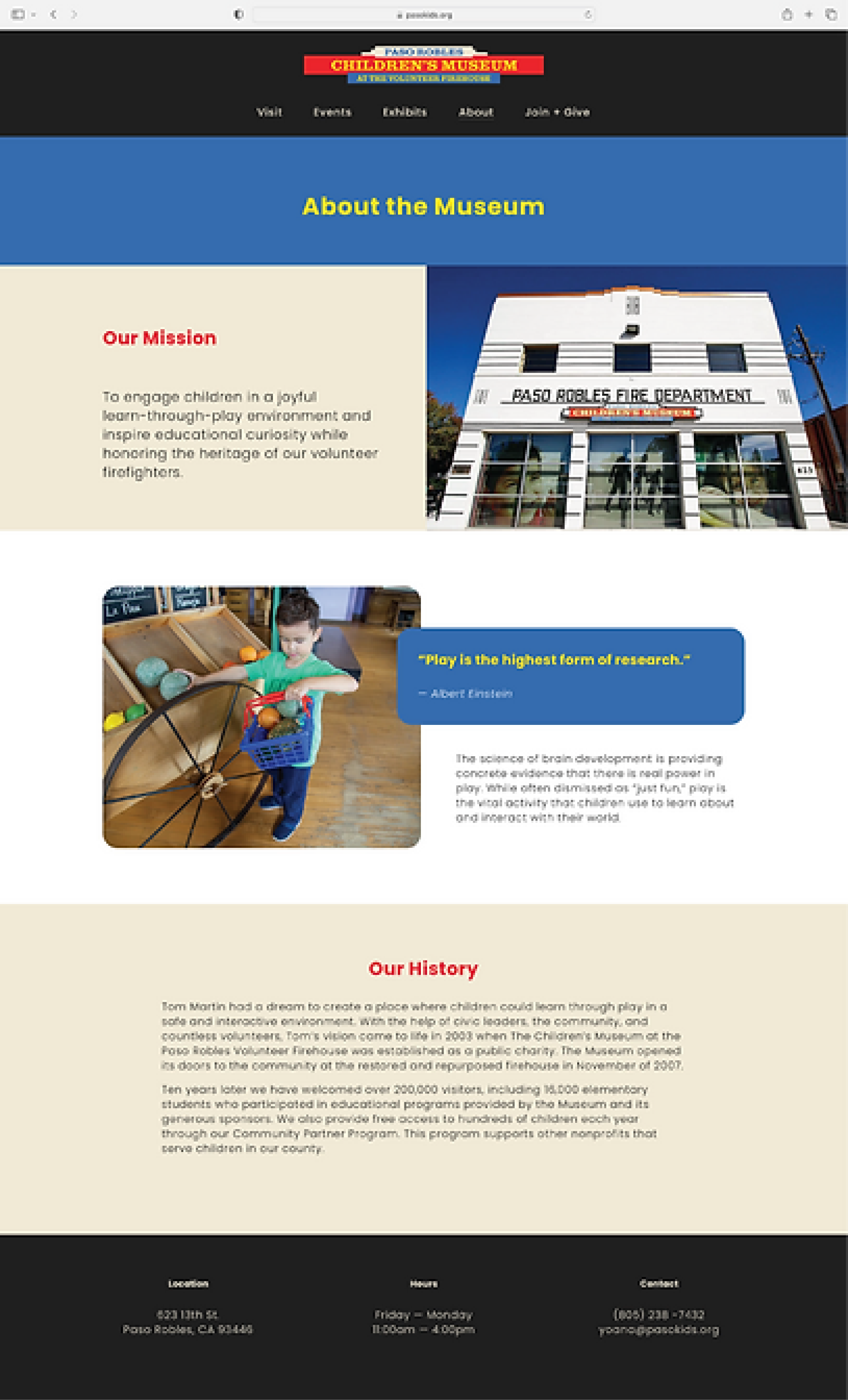
Some before (left) and after (right) snapshots of our redesign:
All Exhibits
Individual Exhibits
About
• VALIDATIONOn average, users took 9-12 seconds less to navigate to their destination.
We received an overwhelmingly positive response from museum staff, current museum-goers, and potential users. Hocheol Yang, Assistant Professor at Cal Poly, gave us great feedback to conduct A/B testing with different versions of the home page, specifically focusing on the navigation bar, to determine which sections users access the most and what hierarchy and groupings are the most intuitive.
• LOOKING BACKWe created something that would add real, measurable value to the museum.
In addition to serving as UX/UI designers, we also served as photographers, copywriters and editors, and rebuilt the website from scratch on Squarespace, a platform neither of us were too familiar with. Working with a real-world, local client also added a level of accountability and professionalism to the project.


